NairaCompare
Nigeria's largest financial marketplace, one place to compare loans, savings, investments, FX and insurance side by side. I lead design across every vertical, from the comparison engine to the design system that keeps it all coherent.
I design products that think, challenge briefs that need challenging, and ship experiences that actually work, across fintech, AI, and B2B platforms.
Nigeria's largest financial marketplace, one place to compare loans, savings, investments, FX and insurance side by side. I lead design across every vertical, from the comparison engine to the design system that keeps it all coherent.
An AI marketing platform built around two agents working in tandem: one finds and nurtures likely buyers inside an institution's customer base, the other carries them through onboarding, application and payment. Designed as one connected system, not a stack of tools.
A consumer AI assistant that turns “which product is right for me?” into a conversation, matching people to loans, investments and FX products and learning their needs over time. Designed to make financial guidance feel human, not robotic.
A comparison platform for Nigerian bettors: live odds, offers and promotions across bookmakers, structured so the best value is obvious at a glance. Built on the same comparison DNA as NairaCompare.
that’s me, probably overthinking a flow *
I turn messy financial problems into products people trust.
I’m Titi, a Lead Product Designer working across fintech, AI, marketplaces and B2B.
I design digital products that help people make decisions, move money, solve real problems, and get things done, and I stay with them from messy problem to shipped V1.
I’m naturally curious, a bit stubborn about the user, and allergic to surface-level solutions. I enjoy turning complex, messy problems into simple, usable experiences that actually work in the real world.
Outside of work, I’m a big reader, a design nerd, a music lover, and someone who believes coffee and long walks fix a lot.
Leading end-to-end design strategy, discovery and delivery across four live products, shaping roadmaps with the CEO, MD and product leadership, and turning business opportunities into shipped products.
Simplified complex investment flows for agritech products, lifting clarity, trust and task completion, with decisions validated through research and usability testing.
Designed websites and mobile apps for clients across energy, sustainability and corporate services, building scalable UI patterns and internal design standards.
Took fintech and investment experiences from wireframes to interactive prototypes, working closely with developers, product managers and designers.
Designed websites and digital products across concurrent client engagements, learning the full product design lifecycle hands-on.
End-to-end ownership of the design process. From messy problem to shipped V1.
Shaping direction upstream, not just executing briefs after the fact.
Designing with AI, and for AI. Making intelligent products feel human.
Making decisions with evidence, not vibes. Testing what works.
Working across teams, mentoring designers, influencing without authority.
What I reach for daily. Fluent, not just familiar.
A resort booking site enhancing the guest experience through a unified booking and stay management platform.
Design agency website built as a bold, expressive canvas for the studio's identity and portfolio.
Visit site
A conceptual three-sided marketplace helping users design and buy custom printed cards.
Mobile app connecting users with plastic collectors to enable circular recycling at scale.
Backend interface for managing logistics operations, drivers, and shipment tracking at scale.
Not everything I make lives in Figma. Sketches, paintings, digital art, and whatever's playing on repeat, this is what creativity looks like without a deadline.
A new financial product, three surfaces, a two week deadline, and one shortcut I refused to take. It became the pattern every category after it was built on.
Fund types sit above everything else. The first decision is which kind of investment you are here for, not which provider.
Maxella, our AI assistant, is placed inside the journey rather than in a floating bubble, for people who do not know the vocabulary yet.
nairaCompare is a marketplace for financial products in Nigeria. People come to compare loans, savings and investments, then apply to whichever provider suits them. Providers list with us because that is where the people are.
When I joined in May 2022, an engineer was designing the screens. It worked, mostly. Forms were long and clumsy, pages did not match each other, and there were spelling mistakes on screens asking people to hand over their money.
Investments was not one screen to draw. It was a lifecycle that had to hold together across three different audiences.
The shape of the problem
One product, three surfaces. Redrawn from how the flow actually runs.
Investments was the next big bet, and it did not exist yet. It had to live in three places at once: the website where people discover and apply, the customer portal where they manage and liquidate, and the admin console where our team runs it.
Leadership wanted it fast. The fastest path was obvious, which was to build it on the UI we already had.
I pushed back.
The two paths on the table
The argument I made in the room, drawn out after the fact.
On a money product, a misspelled word is not a typo. It is a trust problem.
In a market where every fintech is fighting to be noticed, launching something that looked unfinished was not a shortcut. It was a cost we would pay later.
The deadline did not move. So I had two weeks to design a full product across three surfaces, with proper ideation instead of reuse. It was more work, and it was visibly more work, which is part of why it was an argument. I did it anyway, because a foundation built once could carry every category after it.
I designed Investments as a single lifecycle: find a fund, apply, manage it, take money out. Website, customer portal and admin console were designed together instead of handed off one after another.
Every fund type runs on the same pattern, from money market through to dollar funds. That is why new categories could be added later without redrawing anything.
Same skeleton, different fund. Six fund types run on this one structure.

Detail, the category rail
One component, six entries, and a calculator sharing the same shape. Adding a fund type is a content change, not a redesign.
The comparison page asks two questions up front, which are how much you want to invest and your risk appetite. Results are then ranked by yield, with the risk profile and the management fee visible on every row.
On a marketplace, hiding the fee until later gets you the click. It also gets you the complaint.
Two questions before any results: how much, and how much risk you want. The list that follows is already yours rather than generic.
Fund types stay as tabs on the results page, so changing your mind does not mean going back to the start.
Yield, risk profile and management fee sit on the same row as the Invest button. The fee is never one click away from the decision.

Detail, one result row
Minimum amount, yield, risk profile and fee, with a help cue on each. On a marketplace, hiding the fee until later gets you the click and then the complaint.
An investment application asks a lot, and most of it is legally required. So instead of cutting fields, I changed what it takes to get through one. Four steps, with progress visible. Save your details and come back. It works on a phone.
The data since backs that up. On average it takes about 48 hours between starting an application and submitting it, and the longest pause sits right at the start. Nobody fills in an investment application in one sitting. They start it, go and think about it, and come back days later. A form that cannot be left and returned to would lose most of them.
What the data showed later
Mixpanel funnel, investment applications. Average time from start to submit.
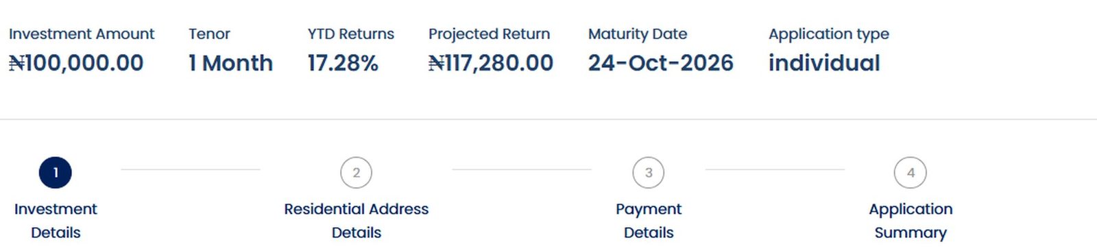
What you are committing to stays pinned above the form: amount, tenor, projected return, maturity date. Coming back two days later, you do not have to remember any of it.
Four named steps, not a progress bar. Named steps tell you what is still coming, which is what decides whether someone starts at all.

Detail, the commitment strip and steps
The numbers and the route, in the same glance. This strip is why an interrupted application can be resumed without rereading anything.
Once Investments shipped, leadership asked for the design to cascade to the other categories.
The bigger change was how we work. Before, ideas went straight to development. Now they go through presentations, feedback loops and high fidelity concepts first. We do not do wireframes here, so I make the idea real enough to argue about before anyone writes code. That process is on every product we build now.
It changed my seat too. I am in ideation with the CEO and MD, and I have demoed concepts to prospective clients.
What came after Investments
Next category on the new foundation. I set the direction from day one instead of inheriting one.
The same engine, dressed for a partner to run as their own.
Designed by the junior designer on my team. I set direction, reviewed and signed it off.
Back to the oldest category on the site to bring it up to the standard the newer ones had set.
Nigerians abroad, and a different set of assumptions about identity, currency and trust.
Investments was the first. It is not the point. The point is what it made possible.
What carried forward
The foundation, and the process that came with it.
The Investments application is not the best form on the site anymore. Newer categories got a better one, and Investments has not been migrated. The landing page has not had a proper redesign in two years.
And some of the conversion gap is not mine to close. Design can make applying easy. It cannot make providers say yes.
That is Investments. The rest of the marketplace is built on what it started.
The pitch changed while the site was being built. My job was to turn a moving commercial proposition into something a bank could read in one pass, then build it so the next change would not mean starting again.
The homepage as it stands today. Everything below is running live, not a screenshot.
The question underneath every review was the same one: what exactly are we selling now, and does the website say the same thing?
This was never a one off redesign. The site became the public face of a commercial proposition that was still moving. Pitch updates changed how Maxella described the opportunity, the product structure and the promise, and each one had to land on the page without producing a different website every fortnight.

Product model. What is core, what is optional, what is bundled, what is sold separately.
Value proposition. What problem Maxella is actually being hired to solve this month.
Commercial claims. What the deck promises, qualifies, or quietly leaves out.
Sales emphasis. What has to lead for the buyer we are in front of now.
The loop I ended up running
Not a project with a finish line. A loop that had to get cheaper every time it ran.
I organised the homepage as an argument rather than a feature list. A financial institution should recognise the demand it is already losing first, understand how Maxella reconnects that journey second, and only then see the product structure and what it keeps long term. The demo request comes last, once the buyer has enough context to want the conversation.
The order of the argument
Recognition first, mechanism second, product third. The CTA is the reward, not the opener.
Maxella runs across systems an institution already owns. There is no single product screen to photograph, which means the usual portfolio move of showing a dashboard was not available. I used sequence, product roles and physical metaphor instead, without pretending the agent is a standalone SaaS tool.
The six stage journey is the load bearing piece. It takes a background process nobody can see and turns it into something a buyer can point at in a meeting.
The journey section, running live. Hover and it responds, because that is the point of it.
The Marketing Agent finds demand, recognises intent, nurtures and qualifies it. The Fulfilment Agent completes the last mile and is optional. That difference had to be visible immediately, because buyers who assume they must replace their onboarding rails to use Maxella stop reading.
Core and optional are not small words on a card. They change how large the commitment feels.
Two agents, deliberately unequal. One leads with outcomes, the other is framed as completion.
Banks, insurers and pension firms do not read a page the way a consumer does. A claim, a recommendation, or an unclear data boundary can create an objection before anyone gets near a demo. So I wrote the constraints down as design rules and held the site to them.
Never quote a rate. A public page should not make Maxella look like the regulated adviser.
Never imply a recommendation. The institution owns the regulated advice and holds the licence.
Never show Maxella deciding for the customer. The visual language has to preserve who owns the regulated action.
Late in the build I went through the site claim by claim against the commercial deck. It surfaced inconsistent search volume numbers, missing caveats, and a real deliverable I had removed myself because it did not fit the layout neatly.
A tidy interface is not worth a commercial mismatch. If the site says one thing and the contract says another, sales has to repair that trust later, in a room, under pressure. Treating commercial accuracy as part of design QA was cheaper for everyone.
The advantage section answers a trust question as part of the pitch: signals stay inside the institution, and the intelligence layer learns across them.
An evolving proposition makes bespoke page design expensive. Midway through I audited the interface and found eight button variants, hard coded headings and inconsistent radii. Every pitch update was quietly costing us a small redesign.
So I moved the site onto named roles: type, colour and components that mean something rather than look a certain way. Orange is the one primary moment on a page. Maroon carries structure. Pink is secondary emphasis. Headings run on a named scale that is responsive by role, not by guesswork.
What the system decides before a new page starts
Orange for attention, maroon for structure and dark panels, pink for support. No page gets to invent a new accent.
Lead, body and small are roles, not sizes someone picks at build time.
Down from the eight variants the audit found.
Section order has rules, so a new page inherits pacing instead of reinventing it.
Responsive rules are explicit. Some diagrams redraw vertically, and true timelines become deliberate swipe experiences rather than squashed desktop layouts.
The product is still changing. The next repositioning should be a content problem, not another round of inventing button heights.
The site went live in September 2026, so there is no conversion data yet and I am not going to invent any. What I can show is what shipped, and the measurement plan I set up before traffic arrived, so the next version of this page can be judged on results rather than intent.
What is true today
What I will measure next
The strongest work here was deciding what the website needed to mean, not what it needed to look like. Listen to the pitch, find the contradiction, make the product legible, protect the regulated boundary, and build something that survives the next version of the story.
Maxella is still evolving. The site is built to evolve with it.
The pitch will change again. That is now a content update, not a redesign.